Elements of Effective Sign Design
VISIBILITY
The sign should be sized appropriately for the viewing distance. Generally, you will need an inch of letter height for every 10 feet of viewing distance. The sign should also be placed in a location with maximum exposure to the target audience.
READABILITY
The sign should be organized in a manner that readily conveys its intended message. Key words and phrases should be emphasized with larger letters, bolder typestyles and additional colors. Ideas should be grouped logically and separated by layout and spacing. Graphic elements, especially digital color graphics, can greatly enhance the speed and thoroughness of communications.
NOTICEABILITY
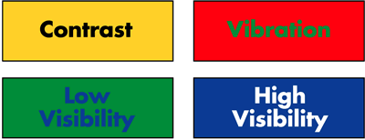
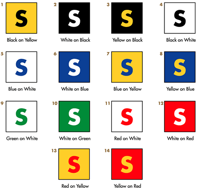
The sign should incorporate some design elements that will help it stand out conspicuously in the landscape. Color contrast, changeable components, motion, uniqueness of design and/or subconscious attraction can serve to make a sign more noticeable.
LEGIBILITY
Typestyle selection is critical to the effectiveness of a sign. The proper font should convey the desired image without sacrificing the ability to distinguish individual letters. Many script and specialty typestyles are difficult to read, especially over greater viewing distances.
DISTANCE & VISABLITY


